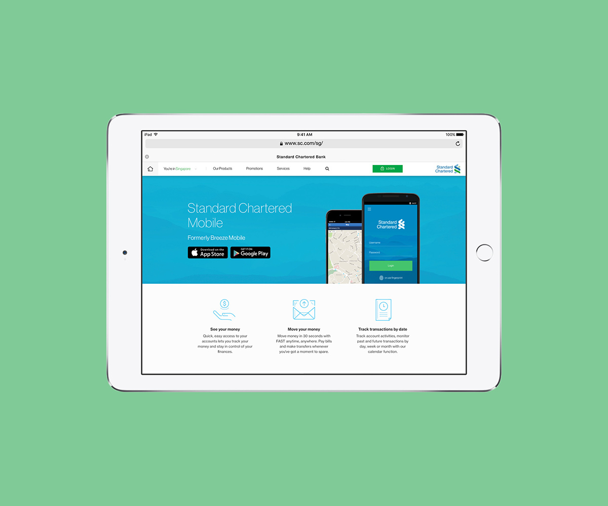
Hanzo Studio was redesigning the website and apps for the Singapore branch of Standard Chartered. Looking for a clean, sober yet forward-looking style, they requested I helped them create an extensive icon family to cover all of this massive bank's needs. The goal was to create an illustrative system that was generous with empty spaces, could be universally understandable and which embraced their logo's curved and parallel lines.

In order to adapt well to minimal and scalable environments, we chose to design the icons always with 3 stroke widths: 1 pixel for the main lines, 2 pixels for the support lines and 1.5 for a small dot/circle. The same widths were applied to 2 families of icons: the main ones, bigger in size for more illustrative uses (such as banners or big menus); and the secondary ones, smaller so that they fit in small menus or crowded forms. Finally, as the big icons were supposed to cover lots of visual metaphors of similar banking services, in order avoid having to design over 200 icons we created a system in which a small circle could be added to most icons on their side and expand their meaning. The color palette, chosen by the studio in charge, was a desaturated or extra bright variation of the brand's traditional blue and green.